
This Site is Under Maintenance
Please excuse the state of the site.
A Wonderful Ticket Buying Experience: Amtrack Reimagined
Amtrak ushers passengers across the US on a nation-wide train system, however the process of booking tickets on Amtrak's website could use some improvements. This is a student project (not affiliated with Amtrak), and hilariously halfway through the project, Amtrak fixed the main problem identified through the research.
-
Responsive Website Project
-
3 months (ending June 2025)
-
1 UX Designer
-
Travel Website

Broken up into 2 phases with a conclusion
An Iteration of Amtrak
Phase 1: Research
The Goal
Discover the true nature of this problem for users, and understand how other companies are addressing this problem.
Competitive UX Pattern Analysis
A review of the UX booking patterns on 3 competitor travel sites, to see how our competitors are approaching user needs.

Other companies have more intuitive filters, a cleaner search bar, and the ability to either see stations on a map or search by address.
User Interviews
Goal
We want to learn how people wish they could book their trains so we can make the booking process on our website more intuitive.
The Interviews
5 interviews of 5 participants, 4 of the them remote, and 1 in-person.
(4/5) There's a lack of Information with station search and information displayed of stations
(4/5) Confusion with price and information want on trains (in train results page)
(3/5) Adding train ticket to cart on desktop website (not intuitive - confusing)
The Affinity Mapping
To draw deeper meaning from the user interviews.


The Research Conclusion
Other companies are doing a better job of fulfilling our user's needs than we are in the intuitiveness of our website. A problem that we can fix.
Phase 2 : Designing the Solution
The New User Flow
To understand the steps users have to take currently to purchase a train ticket to gauge areas of improvement.

Initial Low Fidelity Wireframes


Low Fidelity Usability Test
Technically did 2 tests, as the 1st test did not provide enough usable data, so these are the results of the 2nd low fidelity usability test.
5 participants clicking through a low-fi prototype while sharing screen over zoom in a moderated usability test.
Goal
To gauge how intuitive users actually find our new designs. Done so while they are in the low fidelity stage, to allow for greater flexibility in improvement.
Home Screen Search Bar
-
(4/5) Did task quickly and easily
Train Results Page
-
(4/5) Notes for train selection layout to feel less off
-
(4/5) Participants considered there to be something off about the purchase button
Traveler Details Page
-
(3/5) lack of clarity on filling out the 3 traveler details
Revisions after Usability Testing


High Fidelity Wireframes
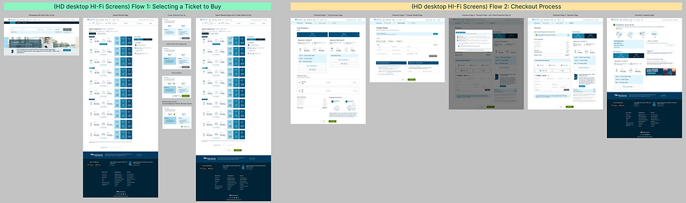
High Fidelity Usability Testing
8 remote usability tests run through Maze of one flow: Buying a Ticket.
Goal
Ascertain if the final design is actually intuitive to users.
Results
(2/8) users did not complete the flow (75% success rate)
8.6 out 10 average rating of how easy the flow was to do
Conclusion
There are some crucial changes that need to be made before launching the new design.


Conclusion
This is the end of me working on this project, however....
Next Steps for the Project
-
Make a 2nd usability test with the revised frames to make sure users see the price buttons and assume that is where they need to click. This iteration should not be launched on the website until the flow is effective.
-
There are plenty of secondary priority revisions that could be addressed in this usability test, or it could be added to the docket for later.
Personal Reflections to Improve as a Designer
-
Learned how to come back to a challenging project after being away from it for so long
-
I wonder if I love making affinity maps too much
-
Making a robust low fi usability test that generates a lot of valuable data in a stage that allows for a lot of flexibility in fixing the design
-
I have some growing to do with HMWs and crafting project goals, organizing feature sets
-
Have a reason for any change to the existing UI, changed too much of the UI of Amtrak without strict reasons